Imagine Software
About
Simplifying complexity through visual clarity.
I designed high-performance brand assets and user resources for Imagine Software, working within a rigorous visual framework. My focus was on transforming technical data into intuitive, engaging visuals that reduce cognitive load and streamline the user’s path to information.
Area of Focus
Icon Designer
Tools
Adobe Illustrator
Adobe InDesign
01
White papers
Visualizing data-driven insights.
I led the design and layout of comprehensive white papers, translating intricate industry analytics into digestible, professional resources. By prioritizing information hierarchy and clean typography, I turned complex medical billing concepts into approachable, high-value assets for stakeholders.

02
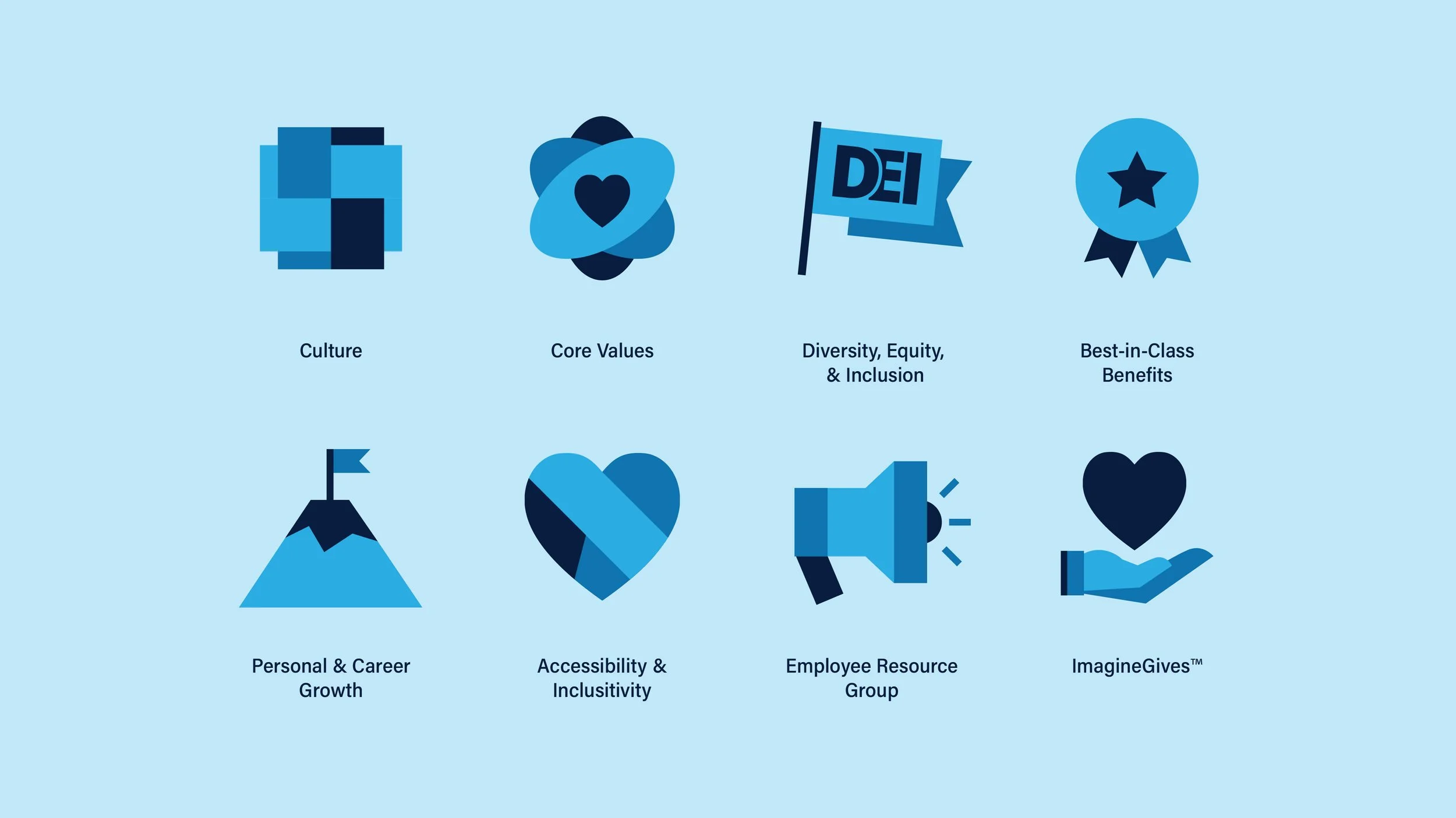
Icon Set
Standardizing the user interface.
I developed a custom iconography suite designed for immediate recognition across Imagine Software’s digital ecosystem. These icons serve as a cohesive visual shorthand, improving navigation speed and ensuring a unified aesthetic across all applications and web properties.
03
ReflectionThis project reinforced the power of design as a functional tool in data-heavy industries. Working within an established brand system taught me how to innovate within constraints—ensuring that every icon and layout served a specific purpose: to make complex financial workflows feel manageable. It was an exercise in precision, proving that when the subject matter is dense, the design must be exceptionally clear to maintain user trust and efficiency.