Hyonic
About
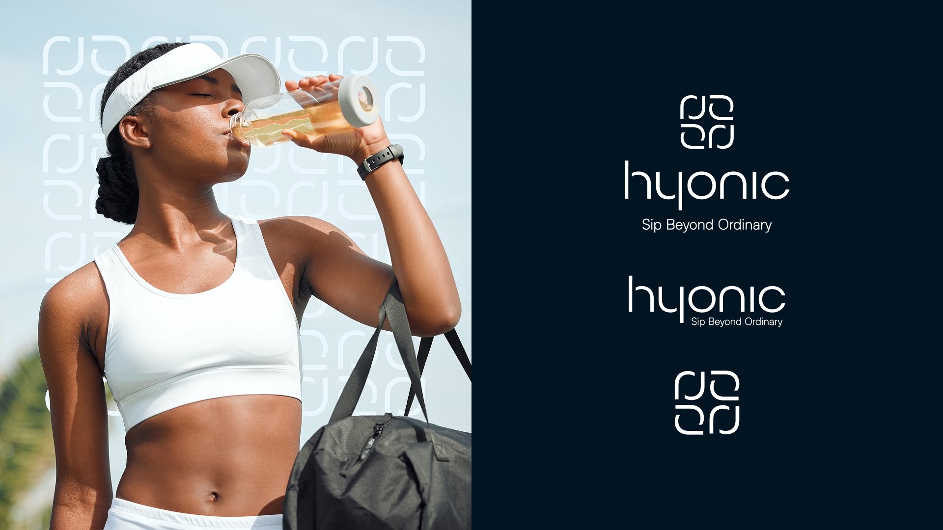
Defining a bold identity for modern hydration.
I led the creative direction and brand architecture for Hyonic, a portable hydration tablet designed for the fast-paced consumer. From visual identity to packaging strategy, I built a cohesive, high-energy brand that translates convenience and flavor into a premium shelf-ready presence.
Area of Focus
Creative Direction
Brand Identity & Architecture
Packaging Design
Visual Systems
Tools
Adobe Illustrator
Photoshop
Figma
01
Brand Guideline
Engineering a scalable brand DNA.
I established a comprehensive visual language and tonal framework for Hyonic. By balancing a modern, airy aesthetic with distinct brand markers, I created a flexible system that ensures consistency across every consumer touchpoint while allowing for future product expansion.


02
Print/Packaging
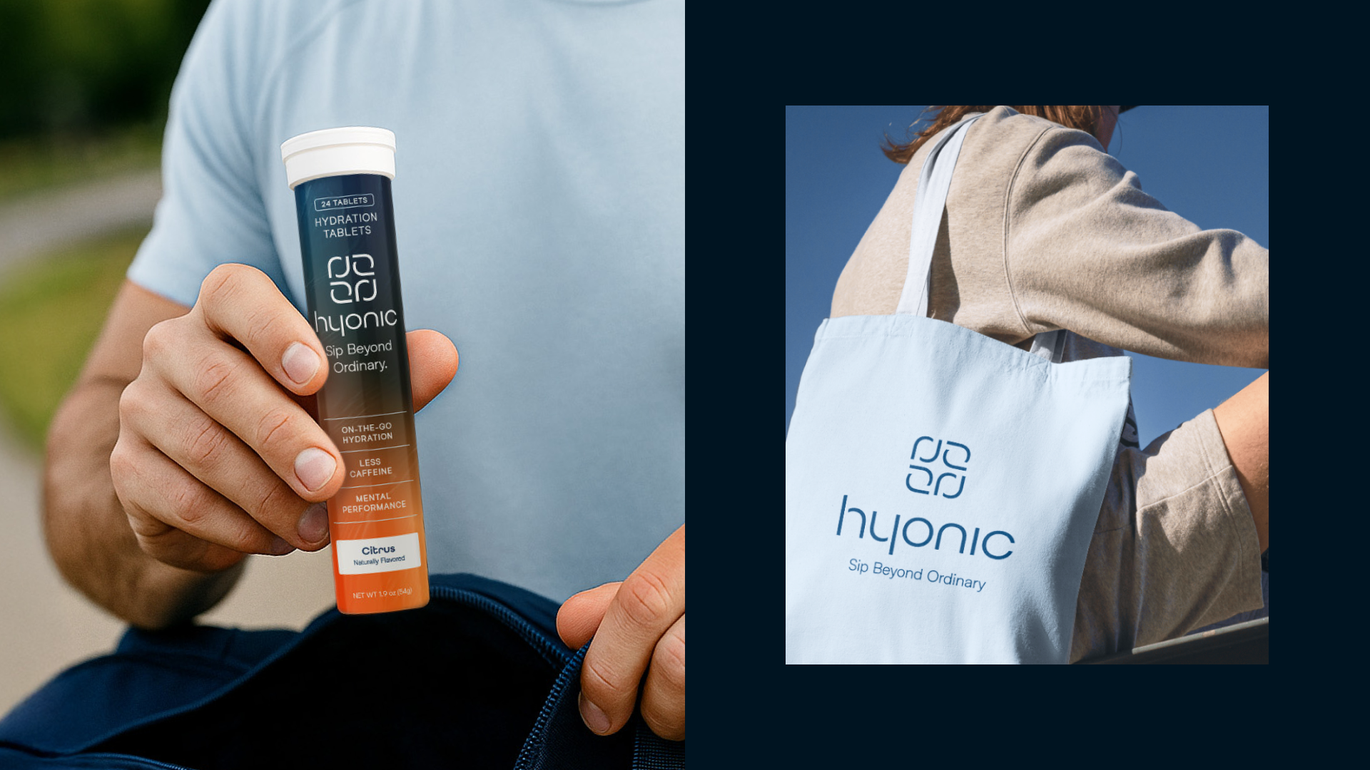
Elevating shelf presence to lifestyle status.
I designed Hyonic’s packaging to bridge the gap between functional supplement and premium lifestyle essential. My approach focused on tactile appeal and visual clarity, positioning the brand as an intuitive, daily ritual for the health-conscious consumer.


03
Digital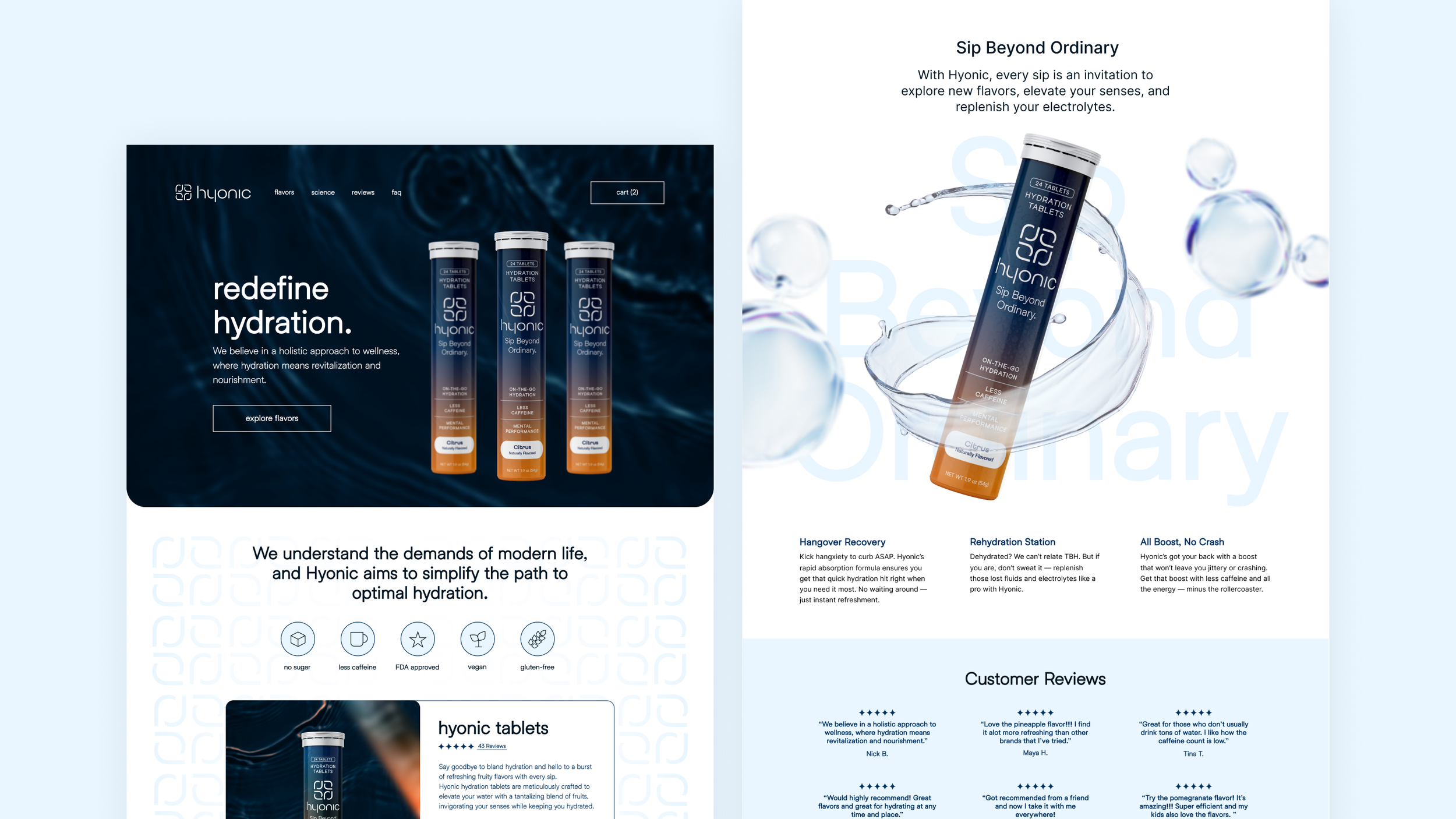
Translating brand energy into digital conversion.
I led the end-to-end design for Hyonic’s digital ecosystem, transforming the visual identity into a high-performance web experience. By prioritizing engagement and user-friendly navigation, I created a seamless path from brand discovery to purchase.
04
ReflectionThis project reinforced the importance of a cohesive brand ecosystem—ensuring that the energy felt on a smartphone screen translates seamlessly to the physical product. By aligning the digital experience with the tangible packaging, I created a unified brand presence that builds trust and recognition at every consumer touchpoint.